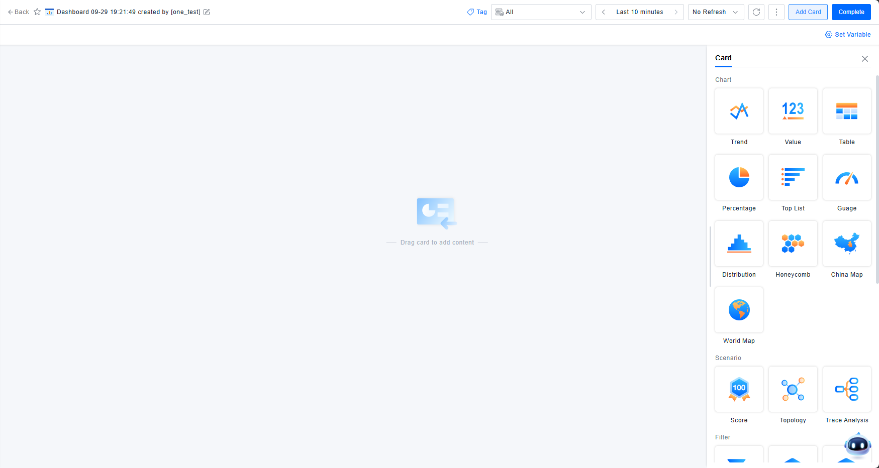
Dashboard Configuration
The Dashboard is a tool for configuring observable data monitoring boards. It is designed to meet all data query requirements, ensuring that every piece of data customers need to observe can be visualized. As a monitoring board, it also requires rich visualization effects and aesthetic appeal. Therefore, the Dashboard provides a variety of charts and functional cards, allowing users to select the most appropriate ones based on their actual scenarios and desired visual outcomes.
Scenario Description
In operational scenarios, it is often necessary to display combinations of different data. In some cases, viewing data for specific objects is also required. Additionally, the Dashboard supports scenarios where customers need to compare data across time and space dimensions to observe changes.
Feature Description
Charts
Chart cards are the most commonly used components in the Dashboard. Ten different chart styles are available, each rendering based on the results returned from data queries and transformations, with varying style configuration options.
Card Styles
The Dashboard offers ten chart types: Trend, Numerical Value, List, Proportion, Ranking, Gauge, Distribution, Honeycomb, China Map, and World Map. Each card has distinct display characteristics. You can choose the appropriate card type based on your specific scenario and visualization needs. Configuration syncs across multiple cards, but note that only Trend, List, Honeycomb, and Map charts support displaying multiple data series on a single graph.
Data Query
Data querying is the foundational prerequisite for all chart card displays. The ONE platform provides two methods: Selection Query and PromQL Query.
Selection Query - Data Selection
Selection Query allows you to query data through point-and-click operations on the UI based on data models. It supports querying five data types: Metrics, Entities, Events, Logs, and Records.
The minimum query unit is a data item or expression (expressions are covered in the PromQL section). Each data item executes one query and returns results.
Metric Query Steps:
- Select the Metric data type. In the metric model, choose a metric by navigating through Entity Category -> Entity Model -> Metric Category -> Metric Name.
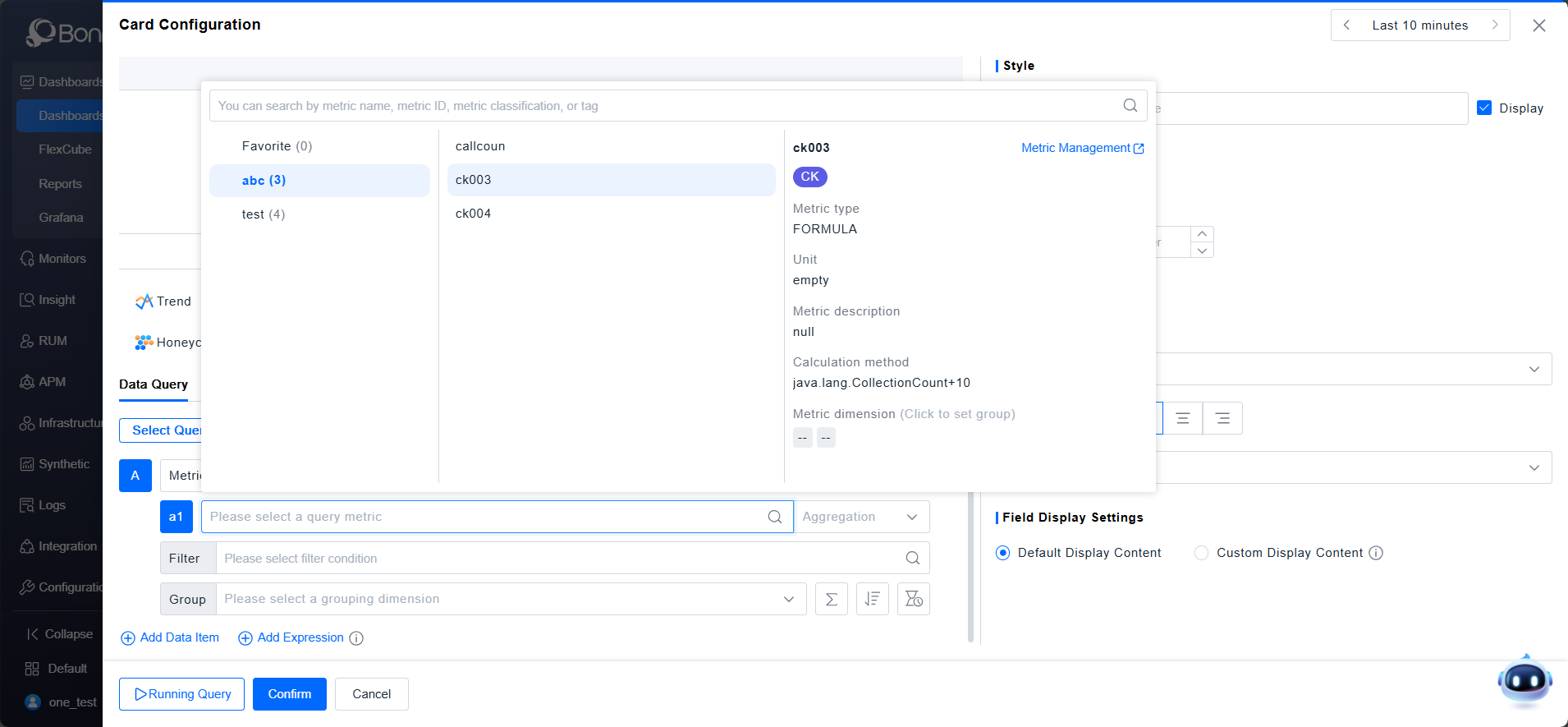
- The "My Favorites" category displays metrics marked as favorites in the metric model. Important metrics can be tagged as key metrics for quick selection.
- When selecting a metric, its information is displayed, including metric type, baseline, unit, aggregation method, calculation formula, and description.
- Different metric types support different aggregation methods:
Metric Type Aggregation Methods Default Aggregation gauge Average, Maximum, Minimum, Latest Value Latest Value histogram Average, Minimum, Maximum Average sum Sum Sum count_distinct Distinct Count Distinct Count formula Calculate Calculate - After specifying a metric, querying without filters returns results for all instances. To query data under specific conditions, add filter criteria. Metric filters include three aspects:
- Entity Dimensions: Each metric has defined related entities. Attributes of these related entities can filter the metric.
- Metric Dimensions: Independent query dimensions specific to the metric, unrelated to entities.
- Metric Values: Filter based on the metric value magnitude. To ensure accuracy, value filtering is applied after grouping.
- By default, query results are aggregated into a single value. To view metrics across different dimensions, specify grouping conditions. Metric grouping includes two aspects:
- Entity Dimensions: The downstream attributes of the metric's related entities can be used for grouping. Not all attributes are available for grouping; this depends on the storage method of the entity and metric.
- Metric Dimensions: Independent grouping dimensions specific to the metric.
Entity/Event/Record/Log Query Steps:
- Select the Entity/Event/Record/Log data type, then choose the object by category.
- For these data types, both Aggregate Statistics and List Display functions are provided. List Display is only available within the List card.
Aggregate Statistics (Example: Entities):
- Aggregate Statistics performs aggregated calculations on attributes.
- Select the attributes to aggregate by choosing Entity Type -> Entity Attribute(s). Multiple attribute aggregations can be added within one data item. The aggregation method depends on the attribute type:
- Text, Time: Count, Distinct Count.
- Numerical: Average, Sum, Maximum, Minimum.
- Filters can be applied based on entity attributes and entity tags. Operators vary by attribute value type.
- Grouping dimensions include entity attributes and tag keys.
Differences between Entity/Event/Record/Log queries:
-
The selection of Entity Model / Event Type / Record Type / Log Index determines the available attribute fields in the next step.
-
Entity data lacks timestamp information and cannot generate trend graphs in aggregate statistics.
List Display (Example: Entities):
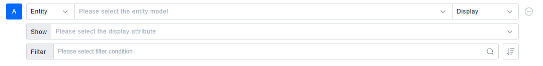 List Display provides a quick way to build lists and is only effective in the List card style.
- Directly select multiple attribute fields for display to quickly build a list.
- Add filter conditions based on attribute fields.
- List Display does not support custom grouping; it inherently groups by each detailed data item's ID, showing granular data.
Selection Query - Additional Features
Deep Analysis:
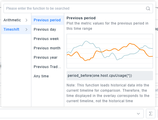
Beyond displaying registered data, the Dashboard provides quick data processing methods to enhance user experience, including: common arithmetic transformations for metrics, and quick access to historical performance data.
Entity/Event/Record/Log List Display shows raw data and does not support Deep Analysis.
Sorting & Limiting:
The Dashboard allows selecting the data scope and quantity. Use Sorting & Limiting to sort data based on a specific metric or attribute field and display a defined number of results.
![]()
Time Aggregation:
- Trend charts automatically aggregate data based on a default granularity derived from the time picker's range. The Dashboard supports manual time granularity selection for Trend cards to meet different needs.
- List cards, which typically lack time information, can also use time aggregation to display time fields, enabling comparison of multiple metrics within the same timeframe.
- To maintain optimal data density in trend lines, the effective granularity options relate to the selected time range:
Time Range Length Default Granularity Available Granularities (0, 3h] 1min 1min, 10min, 1h, 6h, 1d (3h, 1d] 10min 1min, 10min, 1h, 6h, 1d (1d, 7d] 1h 10min, 1h, 6h, 1d (7d, 14d] 6h 1h, 6h, 1d (14d, ∞) 1d 6h, 1d - If the time range is too large for a fine granularity, the default granularity will be used.
- Entity data lacks timestamps and does not support time aggregation.
Expressions
Some metrics require calculation via expressions, e.g., calculating success rate from error count and total count, or computing health scores.
- Expressions support operators and functions like
+,-,*,/,max,min,round, and ternary operations (which can use||,&&,==,>,>=,<,<=to build logical expressions). Use metric IDs and operators to build expressions. - Special Operator Usage:
max: Returns the maximum value, e.g.,max(a, b)returns the larger ofaandb.min: Returns the minimum value, e.g.,min(a, b)returns the smaller ofaandb.round: Controls decimal places, e.g.,round(1/3, 2)returns0.33.||: Logical OR, e.g.,(a>1) || (b>1)returns1if either condition is true, otherwise0.&&: Logical AND, e.g.,(a>1) && (b>1)returns1only if both conditions are true, otherwise0.- Ternary Operator: Returns a value based on a logical expression, e.g.,
a > b ? x : yreturnsxifa > bis true, otherwisey.
- Usage Example:
- Add metric a1 (CPU Usage) and metric b1 (Memory Usage).
- Expression:
(a1>80 && a1<95 || b1>85 && b1<95) ? 2 : ((a1>=95 || b1>=95) ? 3 : 1) - Meaning: The expression evaluates to
2if CPU usage is between 80%-95% OR Memory usage is between 85%-95%. It evaluates to3if CPU usage >=95% OR Memory usage >=95%. Otherwise, it evaluates to1. This expression helps flag hosts nearing or exceeding resource thresholds.
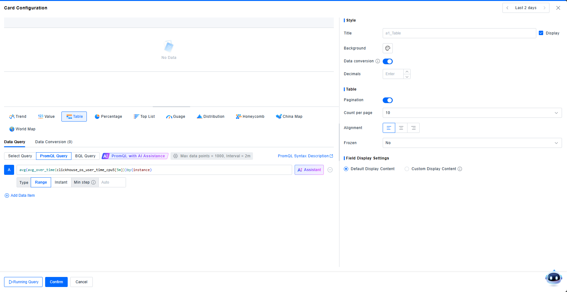
PromQL Query
In addition to Selection Query, PromQL Query is another common method. Click PromQL Query and enter the correct query syntax to retrieve metric data.
PromQL Query only supports metric data, not Entities, Events, Records, or Logs.
Data Volume Settings
- These settings apply to all queried data items, controlling query granularity via maximum data points and minimum interval.
- Max Data Points: The maximum number of data points per series, used to calculate the step interval. Defaults to a value based on card width. For optimal display, the maximum cannot exceed 1000.
- Min Interval: The minimum time interval between two data points. Recommended to match the data reporting frequency. Default is 15s.
- Interval: The actual step interval used for querying, calculated as
Time Range / Max Data Points.
- Example: Querying metric A for the last 1 hour in detail.
- Default Max Data Points=1000, Min Interval=15s. Calculated Interval = 1h/1000 = 3.6s < 15s. Final Interval used = 15s.
- If Max Data Points=50, Min Interval=15s. Calculated Interval = 1h/50 = 1.2min > 15s. Final Interval used ≈ 1min.
PromQL Syntax
The ONE platform is highly compatible with PromQL syntax (99.44%). Refer to the PromQL Syntax Guide for detailed specifications.
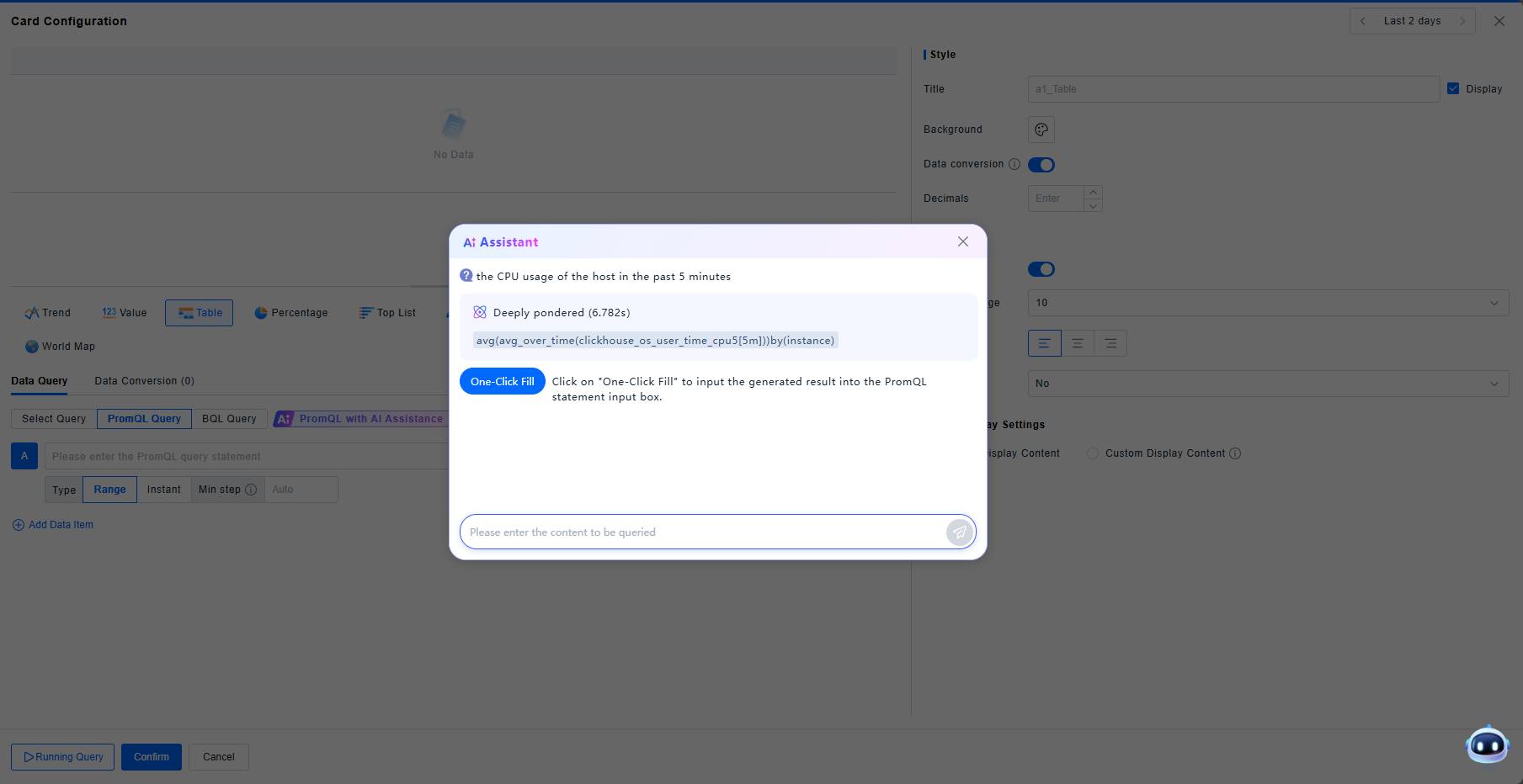
AI Assistant
The Dashboard incorporates AI capabilities for generating PromQL queries. You can ask the AI assistant to generate PromQL statements directly.
-
Click AI Assistant for PromQL to jump to the PromQL query interface.
-
Click AI Help within the input box, and ask the assistant in the pop-up window, e.g., "Query CPU usage for hosts over the last 5 minutes."
-
Click on One-Click Fill to input the generated result into the PromQL statement input box.
Data Transformation
The Dashboard supports transforming query results, currently offering "Merge Data Items" and "Join by Field".
Merge Data Items
This function automatically merges data items based on common keys, filling missing values with --. No configuration is needed.
Example: Data Item A:
| Host | kafka broker | cpu_usage_latest |
|---|---|---|
| br-apm-005 | 10.241.20.65.9092 | 53.54% |
| br-apm-004 | 10.241.20.64.9092 | 33.79% |
| br-apm-003 | 10.241.20.63.9092 | 19.56% |
Data Item B:
| Host | OS | cpu_usage_latest |
|---|---|---|
| br-apm-005 | windows | 53.54% |
| br-apm-004 | linux | 33.79% |
| br-apm-002 | AIX | 19.56% |
Result after merging:
| Host | kafka broker | OS | cpu_usage_latest (A) | cpu_usage_latest (B) |
|---|---|---|---|---|
| br-apm-005 | 10.241.20.65.9092 | windows | 53.54% | 53.54% |
| br-apm-004 | 10.241.20.64.9092 | linux | 33.79% | 33.79% |
| br-apm-003 | 10.241.20.63.9092 | -- | 19.56% | -- |
| br-apm-002 | -- | AIX | -- | 19.56% |
Join by Field
This function also merges data items but allows user-defined join conditions (INNER JOIN or OUTER JOIN).
Example using same Data Items A and B:
- Join Type: INNER JOIN; Condition: A.Host = B.Host; Result includes only matching rows (br-apm-005, br-apm-004).
- Join Type: OUTER JOIN; Condition: A.Host = B.Host; Result includes all rows from both tables, with
--for non-matching fields (same as "Merge Data Items" result above).
Field Display Settings
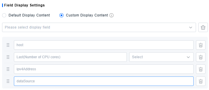
- Field Display Settings control the visibility of each field in the query results, allowing you to modify aliases and set units.
- Default Display: Shows all returned fields by default; not customizable.
- Custom Display: Manually select fields to display and configure their appearance.
- After a query runs, all dimension fields and metric/attribute fields from the results are available for selection. Only added fields will be displayed.
- Change the display order by dragging fields.
- Enter custom text in the input box to set an alias for the field.
- For numerical fields, set a unit. This replaces the original unit label without converting the value itself; the display will be scaled according to the selected unit (e.g., converting bytes to GB).
Scenarios
Scorecard
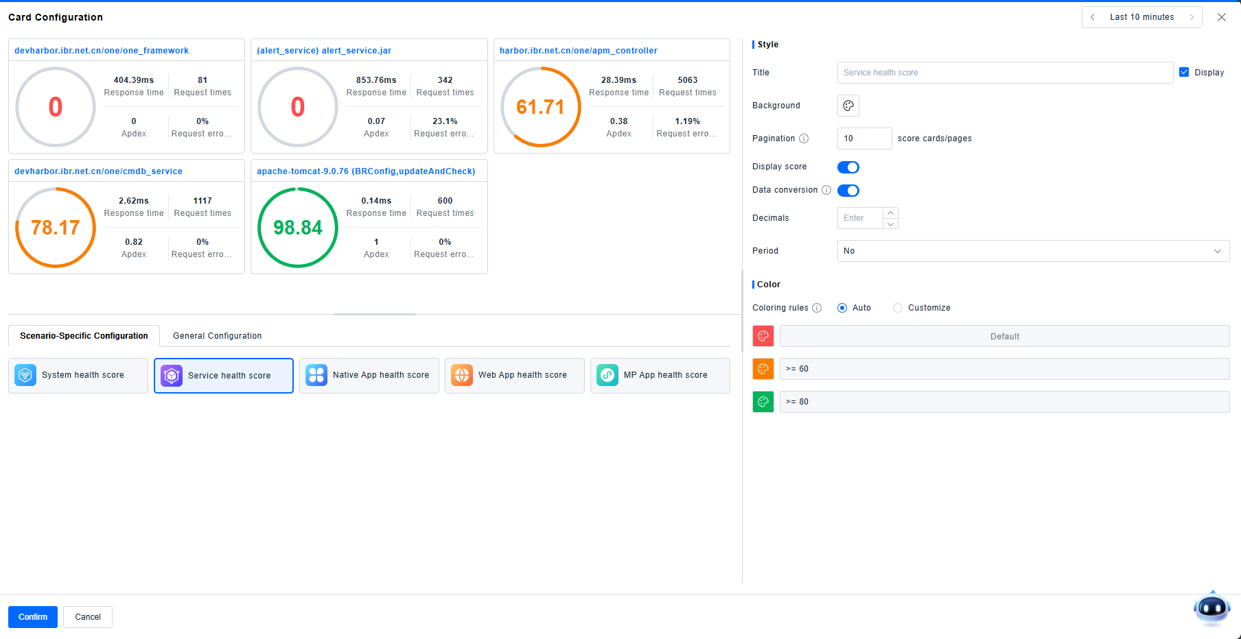
The Scorecard is a specialized card for displaying percentage-based scores (0-100), allowing you to view the health or performance score of different objects based on specific calculations.
- Predefined Scenarios: The Dashboard provides five predefined scenarios: System, Service, Native Application, Web Application, and MP Application. Selecting a scenario automatically configures the card to show the health scores for all objects within that scenario, based on rules defined in Rules Configuration > Health Assessment > Health Score.
- Generic Configuration: This mode allows custom configuration. Users can add metrics and select one data item (often an expression using ternary operators) to display as the score. Scores are capped between 0 and 100.
Topology
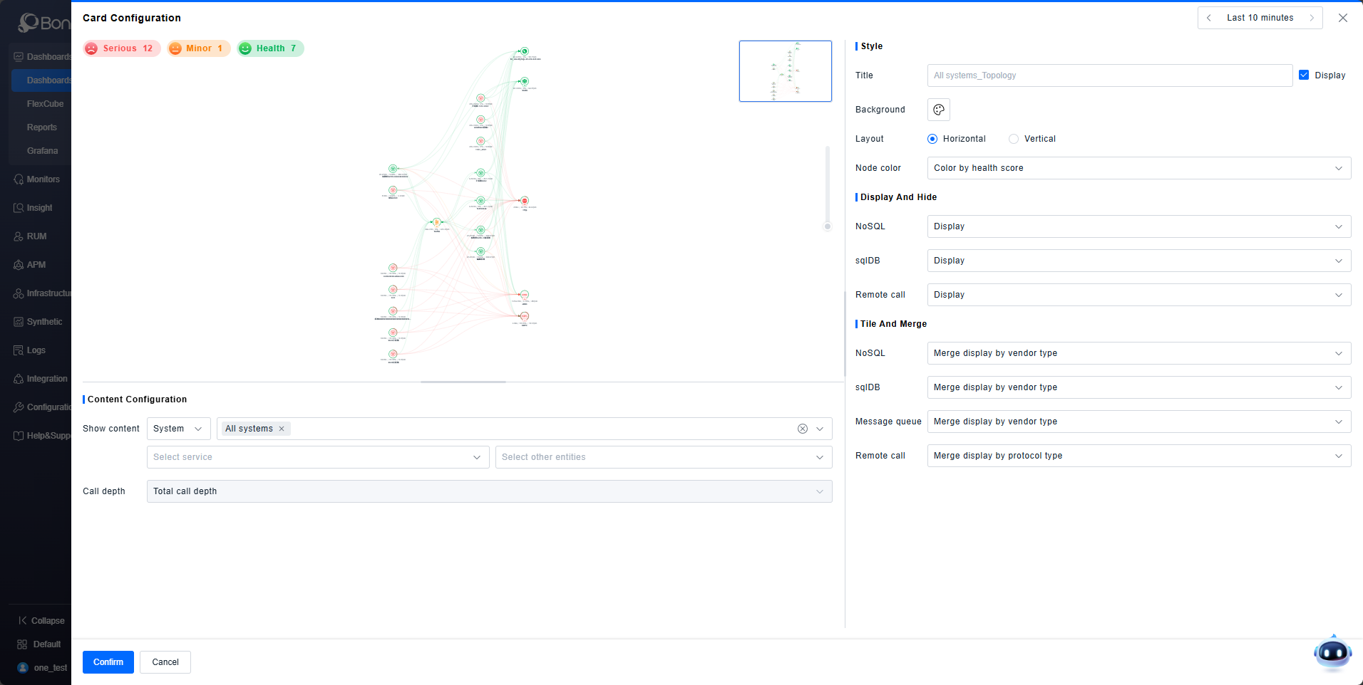
You can display Topology cards in the Dashboard. Select instances from categories like System, Service, Application, Database, Message Queue, or Remote Call to visualize their call relationships, consistent with the view in the Observability Insights > Global Topology module.
Trace Analysis
You can display Trace Analysis cards in the Dashboard. Select instances from categories like Service, Application, Interface, Database, Message Queue, or Remote Service Instance to visualize trace analysis graphs, consistent with the view in the System Services > Trace Analysis module.
Trace Details
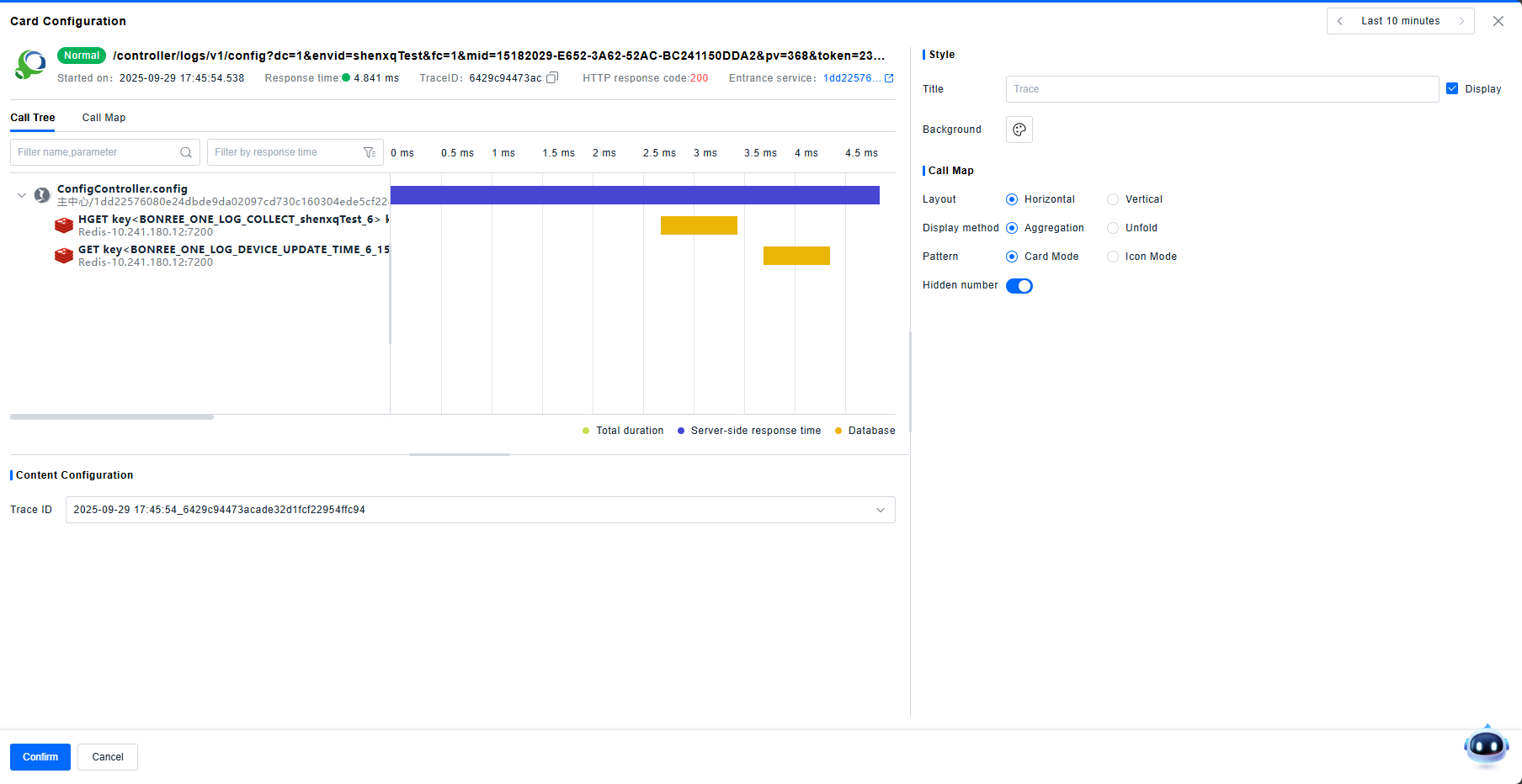
You can display Trace Detail cards in the Dashboard. Enter a specific Trace ID to show the detailed view of that trace, consistent with the view in the Investigation Center > Traces > Trace Details module.
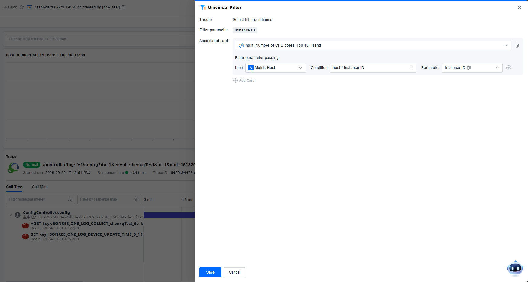
Filters
Often, users want to switch conditions dynamically across the dashboard. Filter cards enable this by providing global, interactive filters that pass conditions to other linked cards.
- Generic Filter: Select one or more fields from data models (Entity Attributes, Metric Dimensions, Event/Record/Log Attributes) as filter parameters.
- Entity Filter: Quickly select a specific entity; all attributes of that entity become available as filter parameters.
- Single-Item Filter: Similar to the Generic Filter but limited to a single field. Presents as a simple dropdown for value selection.
- Time Filter: For comparing data across different time periods, use the Time Filter to set a specific time range and link it to target cards.
After configuration, filters must be linked to other cards via Interactions. For filtering to work correctly, the target card's filterable dimensions must match the filter parameters.
Layout
To ensure an organized visual layout, the Dashboard provides three container card types: Group, Container, and Tab, in addition to query cards.
- Group: Creates an expandable/collapsible section. Collapsing the group hides all cards within it. Useful for categorizing numerous cards.
- Container: A simple container holding multiple other cards.
- Tab: Similar to a container but with multiple tabs. Clicking tabs switches between different sets of cards, ideal for organizing content by scenario.
Other
The Dashboard includes additional card types for supplementary information.
- IFrame: Embeds an external webpage via its URL.
- Text: Displays custom text, supporting variable references.
- Markdown: Renders content using Markdown syntax, supporting variable references.
- Image: Displays an image uploaded from your local machine.