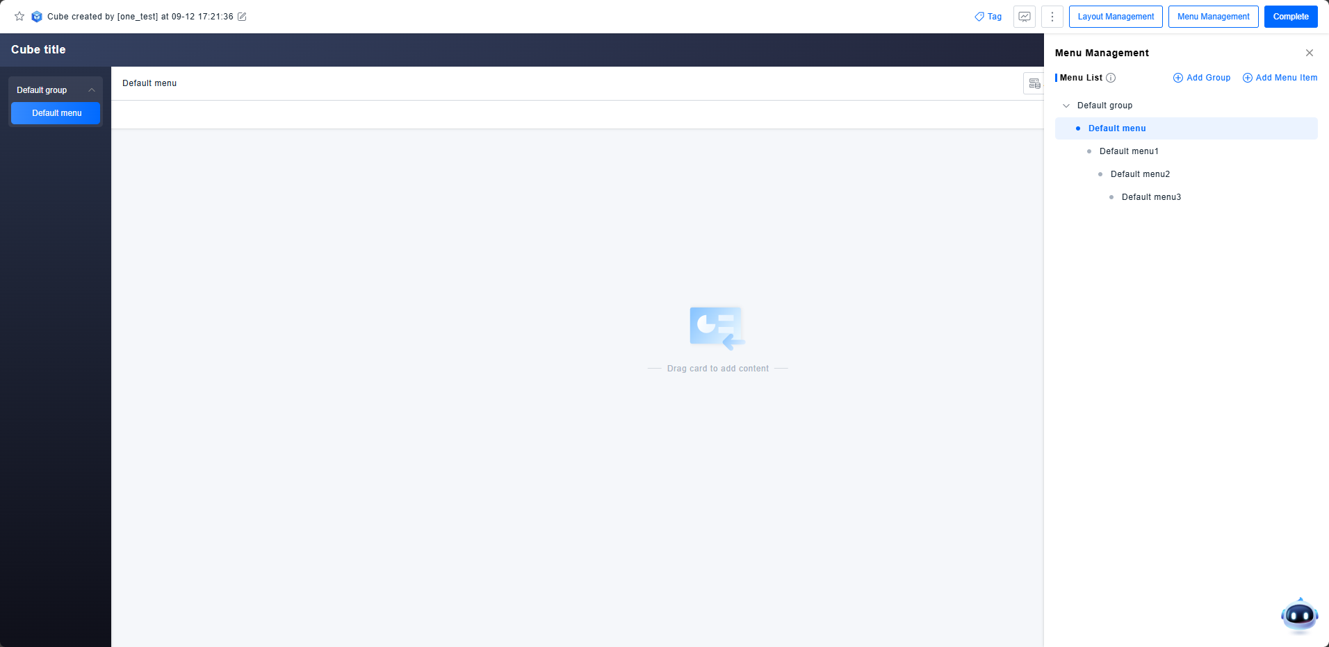
Menu Management
Each Magic Cube application contains multiple menu pages. A well-structured menu clearly represents the hierarchical relationships within the application, facilitating in-depth analysis for users.
Get Started
Menu Construction
The Magic Cube builds a complete navigation structure through Groups and Menus. This hierarchy can be adjusted by adding and dragging items.
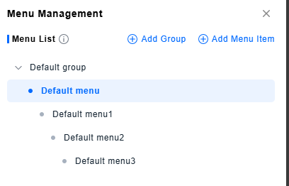
- Group: A Group cannot be selected itself; it serves only as the top-level expandable item in the navigation. Only Menus can be added under a Group.
- Menu: A Menu can exist at any level within the navigation hierarchy. Each Menu can have sub-menus added beneath it. To maintain navigation clarity, sub-menus beyond the second level are not displayed in the main navigation bar but can be accessed through jump interactions from their parent menu.
Settings
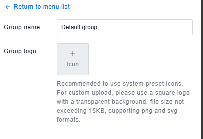
Group Settings
The name and logo configured for a Group will be displayed in the navigation. You can choose a system preset icon or upload a custom image as the logo.
Menu Settings
Like Groups, Menus can have their own unique name and Logo. Additionally, they include the following configurations:
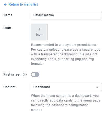
- Landing Page: Controls which menu page is displayed upon opening the Magic Cube each time. By default, the menu with the highest priority is shown.
- Menu Content: Switches the content of the menu. You can configure the menu using dashboard components or enter a URL to embed an external page.
Note: The Landing Page configuration only applies to first-level menus. If multiple menus have the Landing Page switch enabled, only the option from the most recent operation will be retained.
Export
When the menu content is set to a Dashboard, the configuration logic for a single menu is identical to that of a standalone dashboard. To reduce repetitive user configuration, a menu with dashboard content can be exported directly, generating an identical dashboard within the main dashboard list.